Getting Started using Windy.com with Windows 10: - www.windy.com
However, there is so much information on offer, you may find this guide helpful in getting started.
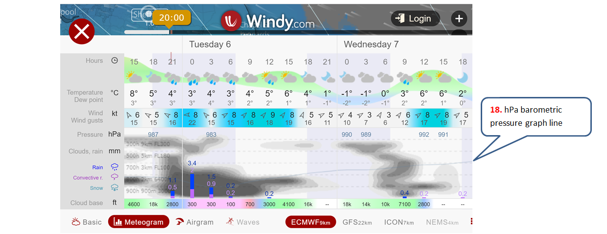
16.
The Meteogram (see
item 5)
expands the rain/snow row of the data table to show:-.
Cloud density,
for each moment in time, is shown at 5 different altitudes, using 3 different
nomenclatures:-
·
900h – 300h being pressure
equivalents of altitude.
·
Km (you guessed!)
·
Flight Levels (FL300 =
30,000 ft. Altimeters use atmospheric
pressure, so they are recalibrated for airport height and current pressure
before take-off. Weather-related
changes in atmospheric pressure cause the aircraft to fly higher or lower than
their nominal Flight Level - but fortunately they are all equally affected, and
collisions are avoided..)
Sea-level Pressure
is shown in the hPa row and is graphed with a thin blue line watermarked behind
the data. (See item
17
below).
Quantities of
Rain, Convective Rain, and Snow are shown
digitally, and as a stacked bar graph in each 3 hour period. (Rain in mm, Snow
in cm).
The
height of the
Cloud Base
appears at the foot of the table.
Feedback:- windy@maccinfo.com